
Every organization around the world had different visual content needs that are driven by their business practices, focus and audiences. These content needs often change and evolve over time, so it is important to follow the following best practices when creating effective digital signage content.
1. Ensure consistent branding
Your digital signage should reflect your organization as much as your website, logo, markting collateral, events and office decor. Most companies have a style guide which dictates what fonts to use where, acceptable ways to use your logo, and other creative directives. This is a good tool to ensure the look and feel of your screens are not only consistent with each other, but also with company guidelines. In organizations with multiple offices or geographic locations or in franchise situations, managing a consistent brand image is extremly important. Building digital signage using standardized brand/company guidelines makes the job of creating content for an organization various screens and devices dramatically easier.
2. Promote legibility
On digital signs the viewer needs to be able to absorb the information with a quick glance or it will not be effective. This means the font sizes, background and foreground colours, icons, charts, and other content items should be visually clear in the environment in which the screens exist. If people are viewing the content from a distance it will need to be kept simple, large and with good contrast. It is generally advisable to avoid putting too much information on the screen - it makes more sense to break up the information onto multiple screens and have them rotate through in a sequence.
3. Deliver key focus points
"Simplicity is the ultimate sophistication - Leonardo da Vinci.
Although there can be a tempation to present lots of different types of information on a single screen, this can distract people from absorbing what is most important. When planning your screens identify the one or two most important pieces of information you need to get across and focus on those in your layout and design. Certain elements like time, date, and logos won't be distracting as they are easily recognizable and will only be absorbed if the need is there.
4. Select appropriate icons and images
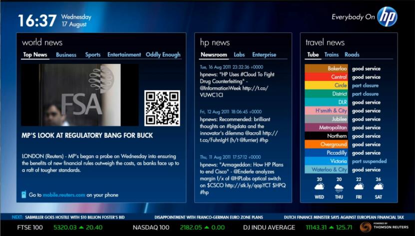
As they say, a picture is worth a thousand words. Wherever possible, represent information as images, icons, charts and guages rather than text alone. There are many different types and styles of charts. Choosing the right chart type can make a big difference in the legibility and comprehension of the underlying data.
Generally speaking,
- Bar charts are better than pie charts
- Use a horizontal bar chart for ranking different scenarios
- Use a vertical bar chart for time comparisons
- Line charts are used for connecting continuous data on an interval scale
- Bullet charts are great for showing value vs. targets such as KPIs