
It can be safely said that color is the most important design element. In fact, I put color's importance on par with design's most important principle, contrast.
Why is color so important? Well, we all have a favorite color. We all have a different relationship with color; we all have our likes, our dislikes, and we all view color differently.
Aside from our personal views on color, color helps us communicate more than just words are able to; it can help convey emotion and invoke a feeling when viewed. You can convey the tone and support the message with color. And color can also help you establish a hierarchy in your design, so you can guide your audience to specific elements in your design.
Brand Guide
So, where do you start with color? Well, most organizations have some form of brand guidelines. In fact, your organization has likely spent a lot of time and money creating a brand guide.
A comprehensive brand guide highlights everything from logo usage to fonts to color. Great brand guides won't just give you Pantone and hex codes for your brand's colors; they'll also tell you how best to use the colors and the meaning behind the colors, why they were selected, and what they are intended to convey.
If your organization has a brand guide, then take a few minutes and ensure you understand your brand colors and how they should be used. Additionally, learn where you have the freedom to use other colors. Many brand guides highlight secondary colors that work with your primary colors and can be used for different applications.
Why is color so important in brand guidelines? Color is often what people associate most with a brand and its visuals. It's what people remember! Consider what colors mean - for example, red is often associated with anger or danger; however, when paired with green, it has a distinctly Christmas feel. Red and white are perceived to be related to help, medical or first aid. Red and yellow are considered the most appetizing colors and can make viewers hungry. You will often see these colors or variations in quick-serve restaurants. For example, what colors immediately pop into your head when you think of McDonald's? Without pausing, most people can name the colors - red and yellow.
Understanding Color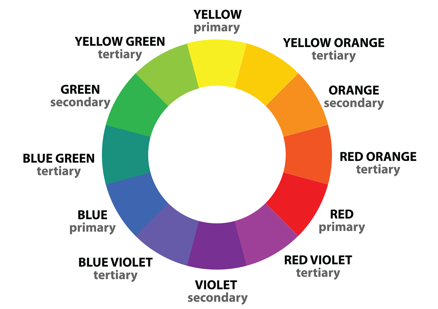
The color wheel is critical to understanding and working with color. There are a few essential terms to understand when it comes to color - hue, chroma or saturation, and brightness.
- Hue refers to where the color falls on the color wheel.
- Chroma (also called saturation) refers to how rich a color is.
- Brightness (also called value) is a color's relative darkness or lightness.
Color Harmony
Analogous - Colors that are next to each other on the color wheel.
Monochromatic - A single hue with tints (made by adding white) and shades (made by adding black).
Triad - Three colors evenly spaced out on the color wheel.
Complementary - Two colors at opposite ends of the color wheel. Probably the most popular of the color schemes.
Split Complementary - Made by taking your primary color and two colors next to its complementary color.
Double Split Complementary - Made by taking your primary color, two colors next to the primary color, and their complementary colors.
Square - Colors that are evenly spaced on the color wheel. This one can be fun and gives you a few more colors to play with.
Shades - Variations of a single hue.
Adobe has a great website to check out and play with the colors for your designs.
Contrast
Complementary color schemes can be fantastic and are often people's go-to scheme of choice. People often come to me with a complementary color scheme in mind because they read these are the best color harmonies to use. However, while complementary color schemes are great for many things, there may be better solutions for your design.
At the beginning of this blog post, I said color was the most important design element, right on part with what I consider to be the most important design principle, contrast. When using colors in your design, it's essential to look at the contrast between your colors. You should always evaluate your selected colors, and whether they will meet the level of contrast you need in your design.
Again, contrast refers to a visual difference in elements of your design. When you consider contrast in every aspect of your design, you'll have a more effective and visually pleasing layout.
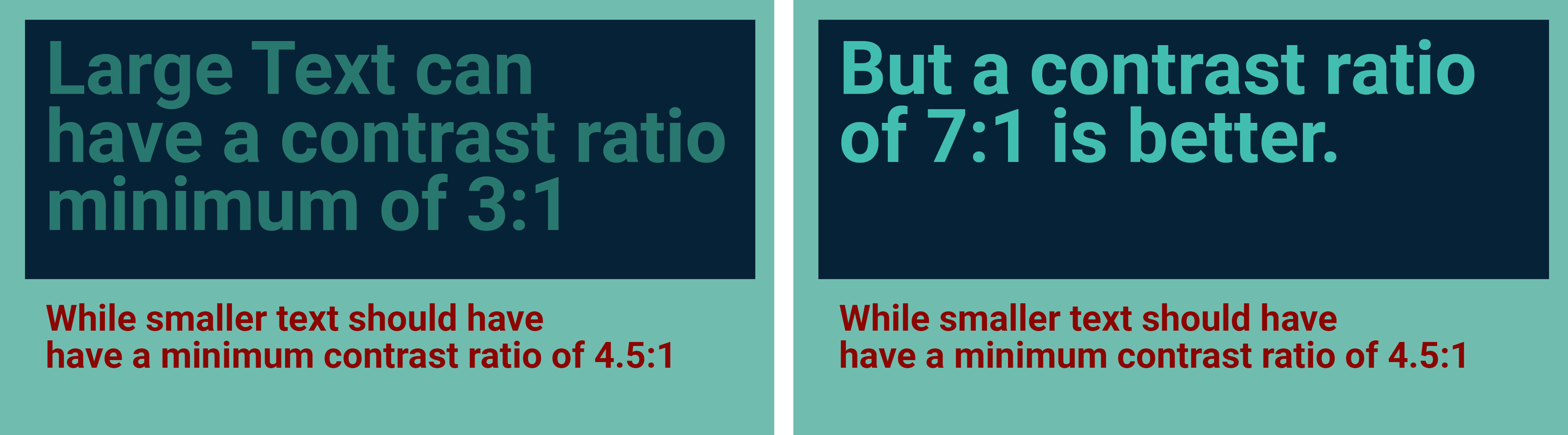
When it comes to contrast in colors for digital displays, we can look to the web design industry for some guidance. For years now, the WCAG (Web Content Accessibility Guidelines) have helped web designers ensure contrast in colors meets certain requirements when it comes to accessibility. They do this by examining the colors used for the background and foreground and looking at the contrast ratio between the two colors. The contrast ratio is the difference between the maximum & minimum brightness or, in other words, the ratio between the brightest white and the darkest black. Good color contrast affects the readability of your content.
Website designers use WCAG to ensure website designs are accessible to people with disabilities. Again, while these are web design guidelines, it's a good practice to follow them for digital signage and design since a computer monitor and an HD screen are very similar.
A higher contrast ratio means better legibility. Ensure the contrast between the text and background is greater than or equal to 4.5:1 for small text and 3:1 for large text.
Consider what you want people to notice first; where do you want to guide their eyes? What do you want them to see? Using one of your screen layouts, look at where you have text that you want people to see and what color it is. What color is the background text? Run it through a color contrast checker to see if you meet ac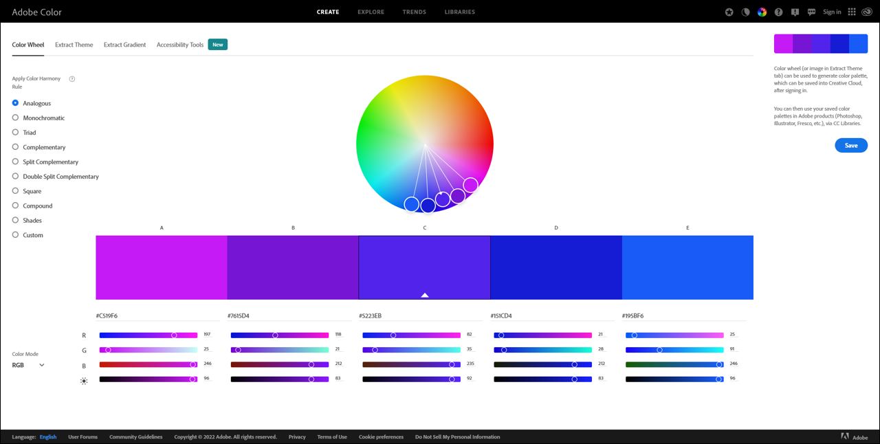 cessibility guidelines. For example, black on white has the highest contrast ratio at 21:1 contrast ratio while white on red has a contrast ratio of 6.27:1. It is important to avoid contrast ratios that fail on the contrast checker. The Adobe Color website offers tools to check your contrast and accessibility for individuals with vision impairments. It allows you to play around with colors and offers suggestions to help you. The US Government also has a great website with great information about accessibility, visual design, and inclusive design practices.
Good color contrast ensures everyone can view and understand your screens, including those who are visually impaired or color blind. There are three main types of color blindness - red-green, blue-
yellow, and monochromacy.
Red-green color blindness is the most common and falls into
different categories: Protanopia (people can see no shades of red), Protanomaly (people can see some shades of red), Deuteranopia (people can see no shades of green), and Deuteranomaly (people can see some shades of green).
Blue-yellow color blindness (or Tritanopia) is when people cannot distinguish between yellow and blue. It is less common than red-green color blindness.
Monochromacy is where people experiencing this type of CVD do not see color but rather look at the world in shades of black and white.
A color blindness simulator is a great tool to ensure your digital designs are visible to those with visual impairments. Upload an image into the simulator and pick which color impairment you want to view your design. It is a really effective tool and is the last step I take when doing a layout in digital.
3 Key Takeaways
- Use your brand guide - Leverage your organization's time and effort in selecting colors and other assets to represent your brand.
- Limit your color palette - That saying "less is more" is true!
- Think of the contrast ratio - Understand how colors work together and which combinations work best for your applications.