Today, digital screens range —from small screens like tablets to massive billboards—which means that one-size-fits-all content doesn't work. Failing to tailor your content to different screens and sizes guarantees you will have reduced audience engagement, wasted time and resources, and generally ineffective communications. Each screen size requires specific adjustments in design, content layout, and technical specifications to maximize the effectiveness of your message.
Before diving into content optimization, let's look at the types of screen sizes generally used for digital signage. They can be divided into three groups:
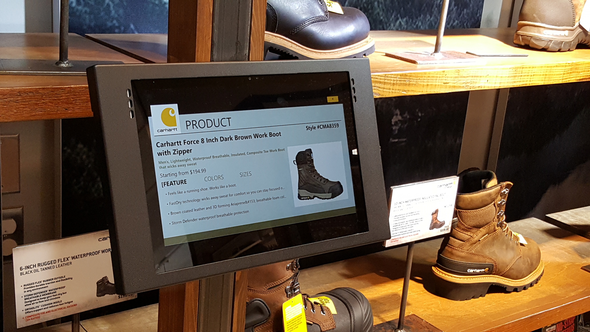
Small Screens (10–32 inches) - Small screens are typically used for kiosks, tablets, point-of-sale displays, or small information display applications. Given their compact size, they require sharp and concise content, minimal text, and impactful visuals.
Medium Screens (32–55 inches) – Often used in lobbies, storefront windows, and waiting areas, medium-sized screens can balance text and visuals. They are large enough for more detailed content but require a thoughtful design to avoid overcrowding the display.
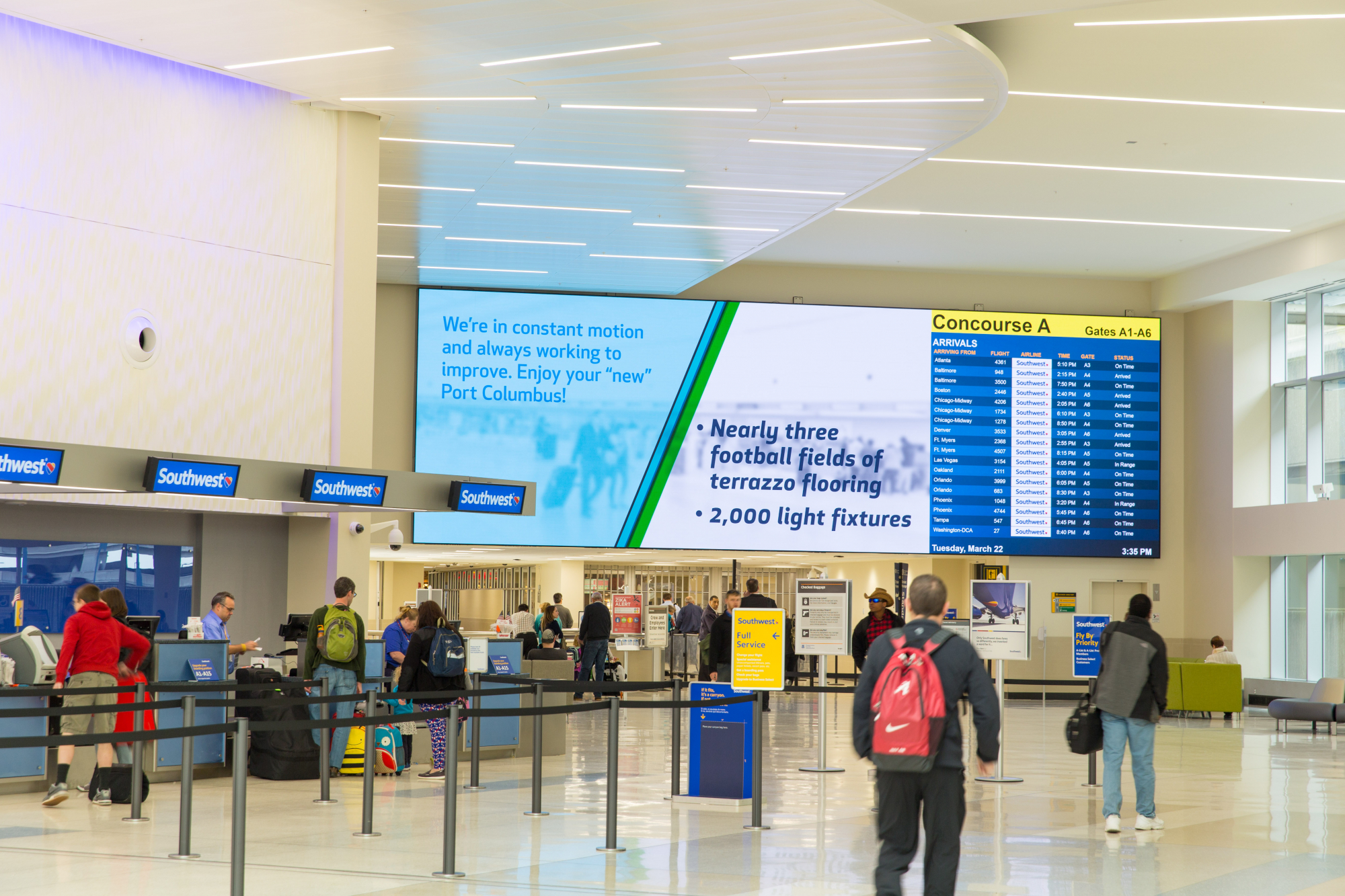
Large Screens (55+ inches) – These screens are most commonly used for video walls, billboards and outdoor displays. Their size allows for high-impact visuals and they can accommodate more detailed information. However, the content still needs to be readable from a distance.
Design Principles
Each screen size has unique requirements for content optimization, and your design approach should vary based on the screen's placement, viewing distance, and purpose.
Small screens require a minimalist design approach. Because they are often viewed up close, content must be concise, visually clear, and easily navigable.
- Text Size: Make sure your text is large enough to read without causing eye strain. Consider short bullet points or brief messages instead of paragraph text.
- Simple Graphics: For graphics, stick to simple, clean visuals that convey your message clearly. Additionally, high-contrast colors ensure screen readability.
- Interactive Elements: Interactive kiosk screens need a touch-friendly user interface (UI). Large, easy-to-tap buttons and navigation elements help avoid user frustration.
- Shorter Duration of Loops: You only a few seconds to grab your audience's attention on a small screen, so keep content loops short and sweet.

Medium screens are popular for waiting areas, storefronts, or digital menus. For these types of screens, it is important to balance size and viewing distance; however, content can be more detailed than on small screens.
- Proportionate Text and Image Ratio: With more screen real estate, you can include a balance of text and images. Ensure your text is easy to read from a moderate distance. The rule of thumb to remember is to increase text size by approximately 20% for every 10 feet away the viewer might be.
- Content Hierarchy: Ensure you create a clear visual hierarchy to guide the viewer's eyes. Use larger fonts for headlines and key information, while supporting details can be in smaller text. Bold and bright images will help capture your audience's attention, while smaller elements can be used to provide secondary information.
- Incorporating Motion Graphics: Subtle motion graphics are a great way to make your content more dynamic without overwhelming the viewer. Make sure you use animations that are smooth and purposeful, enhancing rather than distracting from your message.
- Engagement Duration: Medium screens are often used where there is a captive audience, so a longer content loop works well. However, keep your message under 30 seconds to maintain attention.
Large screens provide an expansive canvas for creative expression but come with their own set of challenges. Often, these screens are viewed from significant distances, making clarity and scale essential considerations.
- Oversized Text and Images: On large screens, use oversized text in bold, high-contrast fonts that can be seen easily from a distance. Like on medium-sized screens, the text should be increased by approximately 20% for every 10 feet away the viewer might be.
- Simplicity in Design: While the screen is large, your content should remain simple. Remember—less is more! Avoid cramming too much information onto the screen. Leverage large, high-resolution images or videos to capture your viewers' attention without overwhelming them.
- Resolution: Large screens require high-resolution content to prevent pixelation. Produce all images and videos in 4K or higher resolution to maintain clarity. Poor-quality images will diminish the effectiveness of your display and your message.
- Motion and Transitions: Large screens lend themselves well to motion graphics, but use them judiciously. Fast-moving graphics can be jarring when viewed from a distance, while slow, smooth transitions may be easier for your viewers to follow.
- Content Duration and Frequency: Generally, your audience will only have a few moments to glance at large outdoor displays, so your content should communicate your message quickly—ideally within 5-7 seconds. By contrast, longer content loops may be used on a large indoor screen if viewers are stationary for extended periods.

Aspect Ratios and Resolutions
While screen size is important, it's also essential to consider the screen's aspect ratio and resolution. Aspect ratio refers to the relationship between a screen's width and height, and common ratios include 16:9 (widescreen), 4:3 (standard), and 21:9 (ultra-widescreen).
- 16:9 (Widescreen): Modern digital displays generally have a 16:9 aspect ratio. Content created for this ratio should use horizontal space effectively, spreading text and images to avoid cramming information into the center.
- 4:3 (Standard): Older or smaller screens may still use a 4:3 ratio, which is more square. Avoid designing content that stretches horizontally in these situations and focus on creating balanced, centered content.
- 21:9 (Ultra-Widescreen): This aspect ratio is ideal for panoramic displays or video walls. Content should flow horizontally, and panoramic images or videos work best here. Make sure to avoid vertical elements that may be cut off by the screen's width.
Additionally, always ensure that the resolution of your content matches the native resolution of the screen you are using. Low-resolution content stretched to fit a larger screen can look pixelated and unprofessional.
Content Testing and Fine Tuning
Testing is one of the most important steps in the content optimization process. Once your content is designed, it should be tested on the actual display hardware to ensure it looks and performs as expected.
- Test for Readability: Ensure text is legible from the intended viewing distance of your screens. Also, consider the lighting around your screens and test content in different lighting conditions, as glare and ambient light can affect readability.
- Check Motion and Timing: Ensure your animations or transitions are smooth and don't distract from the message. Check to see if the timing of each content loop is appropriate for the screen size and audience engagement.
- Adjust Based on Feedback: Gather feedback from real viewers on your content. This information will help you make valuable text size, color, and layout adjustments to improve content effectiveness.
Regardless of whether you are working with small, medium, or large screens, it is important to consider each screen's unique dimensions and viewing environment when designing content. Remember to keep your designs simple and focus on readability. Additionally, make sure to use high-quality visuals to ensure your content is compelling, engaging, and impactful on any screen.
