
Last week, Pantone announced their 2026 Color of the Year, Cloud Dancer (PANTONE 11-4201). It is a crisp, airy white with a subtle softness that feels both refreshing and digital-forward. In an era where screens are everywhere, from retail stores to corporate offices to airport terminals, stadiums, campuses, and hospitals, this near-neutral shade offers an opportunity to elevate, not dominate, screen content.
Cloud Dancer is great for digital signage, highlighting content without overpowering it. It sharpens edges and enhances clarity. It performs well with natural light, motion graphics, and changing content like transit feeds or emergency notices.
Visual and technical considerations for digital signage
While Pantone’s roots are in print, working with Cloud Dancer on screens is possible but requires a translation. Digital white is rarely pure white (that would be #FFFFFF). The digital approximation recommended for screen environments is sRGB/Hex #F2F2ED with a suggested luminance range (for content hierarchy) of 80–95%.
Cloud Dancer’s slightly muted white prevents eye strain and avoids the “overexposed” feel that pure white can produce on high-brightness displays. This is especially important on outdoor LED signage, indoor displays, and corporate installations where content cycles frequently.
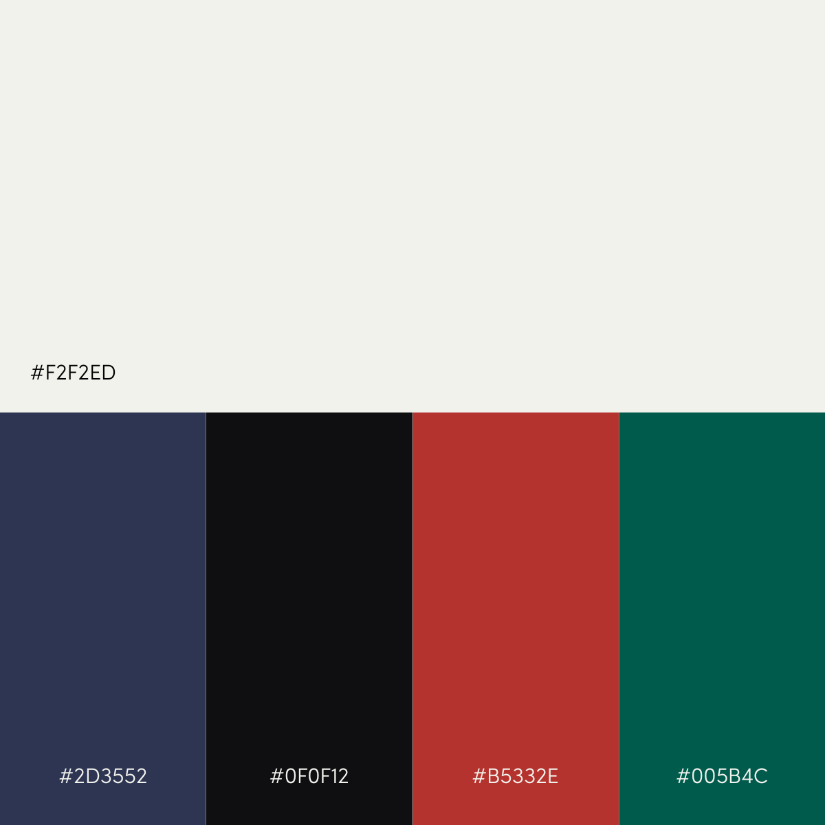
Using Cloud Dancer
Cloud Dancer can be leveraged for a range of digital signage applications. Consider pairing it with deep colors to balance its airy, soft quality, and adding subtle gradients will help prevent flatness on large displays. Complementary deep tones like slate navy (#2D3552), carbon black (#0F0F12), bittersweet red (#B5332E), or evergreen (#005B4C) are great options. Cloud Dancer works well for motion graphics, providing a calm, elegant starting frame before transitioning into branded or dynamic elements.
Retail & Consumer Environments
In retail, Cloud Dancer supports the shift from loud promotional screens to experience-driven environments. It can help create a premium aesthetic similar to high-end product photography. On digital merchandising displays, it will make product imagery feel more vivid and intentional.
Corporate Workplaces
Cloud Dancer offers visual clarity, making it a great background color option for information that needs to pop, such as dashboards, announcements, team milestones, safety communications, and company branding. It has a clean, professional, and accessible feeling.
Transportation & Public Venues
Airports, transit hubs, and stadiums need screens that are functional first, aesthetic second. Cloud Dancer accomplishes both. Its high legibility allows for better contrast ratios for real-time data services—train schedules, gate changes, emergency instructions—without sacrificing design standards.
Healthcare
A soft white tone can help reduce stress and overstimulation in clinical environments. For digital signage in waiting rooms, lobbies, and patient areas, Cloud Dancer supports calm, reassuring visual communication.
Comparing Cloud Dancer to Pantone’s recent Colors of the Year
Here’s how Cloud Dancer compares to previous Pantone Colors of the Year from a digital signage perspective.
Very Peri (17-3938)
Very Peri (digital approx #6667AB) is a vibrant periwinkle infused with a red undertone. This color is great for accent elements and motion graphics; however, when used as a background or in large text blocks, readability can be an issue.
Viva Magenta (18-1750)
Viva Magenta (digital approx #CE0F69) is bold and energetic. It works well for promotional screens, sports venues, or visual emphasis. For sustained viewing, it may be too strong.
Peach Fuzz (13-1023)
Peach Fuzz (digital approx. #FFBE98) is a soft, warm color that works well in hospitality or wellness environments. However, it lacks strong contrast and can be washed out when combined with bright whites.
Mocha Mousse (17-1230)
Mocha Mousse (digital approx. #B68A68) is an earthy tone that pairs well with both vibrant accents and minimalist palettes, making screens feel more refined and approachable.
While you shouldn’t plan your digital signage around Pantone’s Color of the Year, it does provide an opportunity each year to review content and evaluate how to take it to the next level. For 2026, Pantone’s Cloud Dancer enables organizations to create digital signage content that is clear, accessible to diverse audiences, reduces visual fatigue, and is easy to standardize across locations. It provides organizations with an opportunity to rethink design and elevate user experience across sectors such as retail, corporate, public spaces, transportation, education, and healthcare.